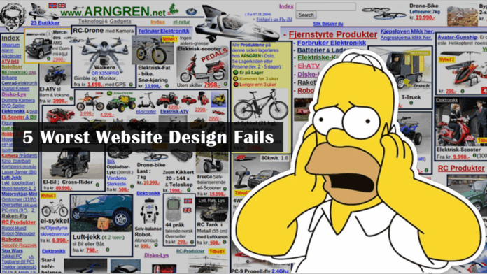
Many Internet users have heard of the term “sticky” site. We will talk in this article about what it is, as well as what are the reasons for this phenomenon, and what needs to be done to avoid such mistakes in the future when developing and promoting the resource. Therefore, do not repeat them if you do not want visitors from your resource to want to run away as quickly as possible. Our ui design agency Fireart offers you some of the worst design projects so that you do not repeat their mistakes.
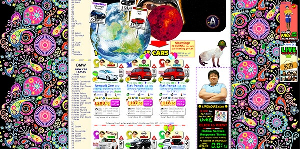
1. Jarring Colors
Too bright colors of the resource, it is better to choose those that do not harm the eyes or shades that do not conflict with each other. When planning website themes, choose colors that complement each other. Yellow is not often used as the main one, but it can serve as an accent. Using rainbow colors is also not always a good idea.
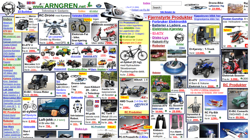
2. Excessive amount of graphics
If you use too many graphics, this can lead to several unpleasant situations. First, the page gets so busy that the visitor is not sure where to click or what interests them most. Second, if the visitor has a slow Internet connection, the page may take a very long time to load. If it doesn’t load in 30 seconds, many will simply leave the resource. People want to get everything at once, if you do not interest the guest in the first few seconds, there is a risk of losing him completely.
3. It takes too long to load
If the resource is loaded so slowly that the visitor can easily make coffee and take a bun, and when he returns, the data will be loaded, this is not very good.
This situation can arise when there are many elements: flash, sound, lots of high-resolution graphics. Over time, pages will load even slower. It is important to keep in mind that many visitors have high Internet speeds, but some who live in rural areas do not have this luxury, so they will not be able to access your site.
Speed is of the essence for engaging with visitors, which is a serious ranking factor. For quite a few years, download speed has been important in resource ranking. Some time ago, Google announced that it will update the page ranking factor in order to track the speed of mobile pages. Since mobile search takes up more than half of queries across systems, it is also necessary to optimize the download speed from gadgets.
Some resources have flashes, there are no visible links to them in order to skip it. Browsers operating at a low speed will find such a site very bulky, which is likely to stop loading, leave such a site and never return here.
4. Lots of advertisements
Many sites and content blogs make their profit through advertising, not sales. But if resource owners lose their luck, they start adding a large amount of ads, which makes it difficult for the visitor to distinguish it from useful content. If a person needs to find an article or some part of it, and there is a lot of advertising information on the page, this can pose serious problems when searching. Accordingly, he will leave such a resource and start looking for another. Therefore, it is better to post one or two ads. With many ads, there is a risk of annoying not only people, but also browsers.
Studies show that about 20% of consumers say that with an overly active advertising campaign, they are alarmed, so they will not use their products or services. Advertising scattered all over the site distracts from the main goal – the search for information.
5. Amateur photo editing
Nothing demonstrates an amateurish level as the quality of photo processing. If the resources have such a problem (cropped images, fuzzy borders, automatic color correction), it looks ugly. Bad layering techniques – it is obvious that we used two images, incorrectly changing the proportions, spliced. People or objects may look strange and unnatural. Therefore, it is better not to publish such images on the site, this will only aggravate the situation with its promotion.
If you have any questions, please contact the experts of our studio at the link: https://fireart.studio/services/motion-design/


